

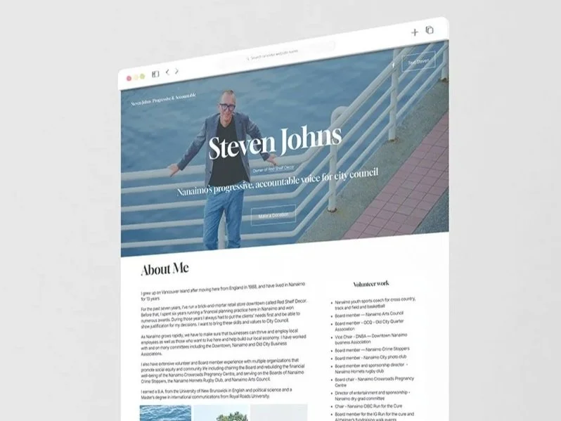
If you read my last post about a website I definitely could not show you, good news: this one is safe for work. I recently designed a new website for Stephen Johns, who is running for Nanaimo City Council. And in keeping with the theme from my last post: Pye Design remains a judgment-free business. Apparently that extends to politics, too. 😉
I recently wrapped up a website for a client whose business is a little outside the kind of work I usually get to share publicly. So, no portfolio reveal for this one. You’ll just have to trust me when I say it turned out great.
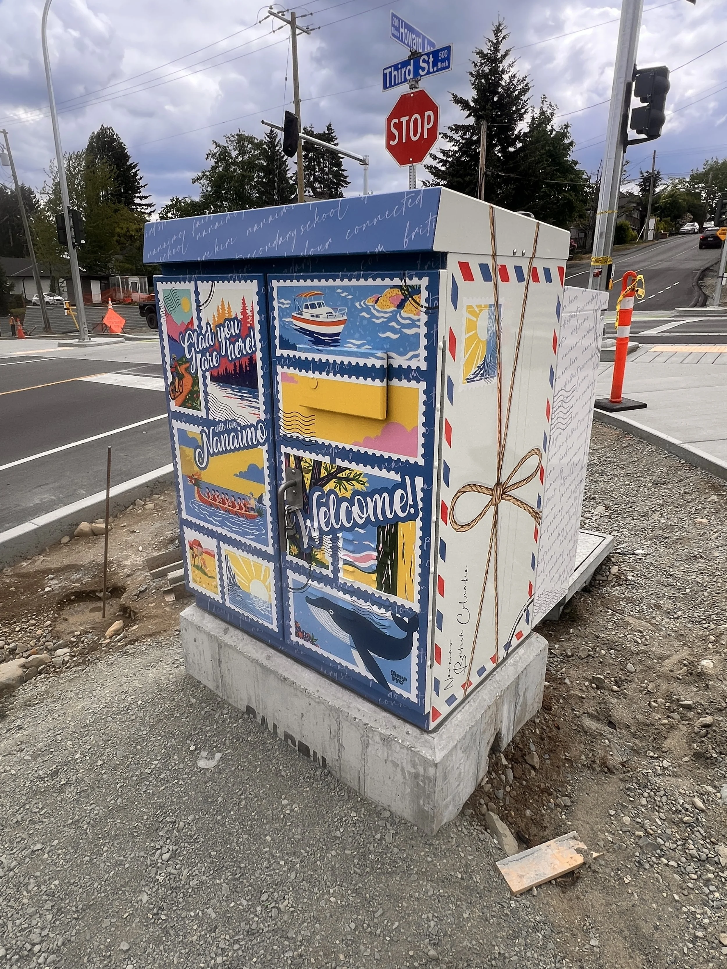
Love Letters from Nanaimo reimagines the idea of a gateway as a message rather than a marker. Instead of simply announcing arrival, the design responds to presence. Drawing from the visual language of handwritten letters, envelopes, and postage stamps, the utility box becomes a piece of civic correspondence, a note from the land itself.

I help companies with their social media. What does that actually mean? It doesn’t always mean creating graphics or scheduling posts. Social media, across all platforms, is a space that should be thoughtfully curated to express your brand’s voice in a digital world.
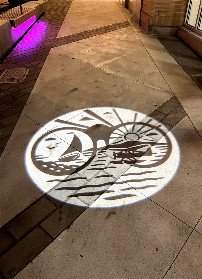
The City of Nanaimo is pleased to announce the launch of a striking new public art installation designed by local artist and Urban Design Roster member Amy Pye, whose series of black-and-white projected artworks are illuminating Commercial Street in time for Winterfest, hosted by the Downtown Nanaimo Business Association.


If you know me, or even if you don’t, you might know that I’m a Trekkie. And because I relate EVERYTHING back to design, let’s dive into the branding lessons that we can learn from Star Trek.

In a notable achievement for local creativity, we are happy to share that we have been honoured with a Bronze Summit International Award in the Logo Design category. This prestigious honour recognizes our work on the logo created to celebrate Nanaimo's 150th anniversary of incorporation.

Throughout the last 10 years I've been fortunate to work so many different kinds of businesses and people. I've learned about industries that I wouldn't have otherwise. And I have met business owners who inspire and feed my own drive. Grateful for every opportunity that has come my way.
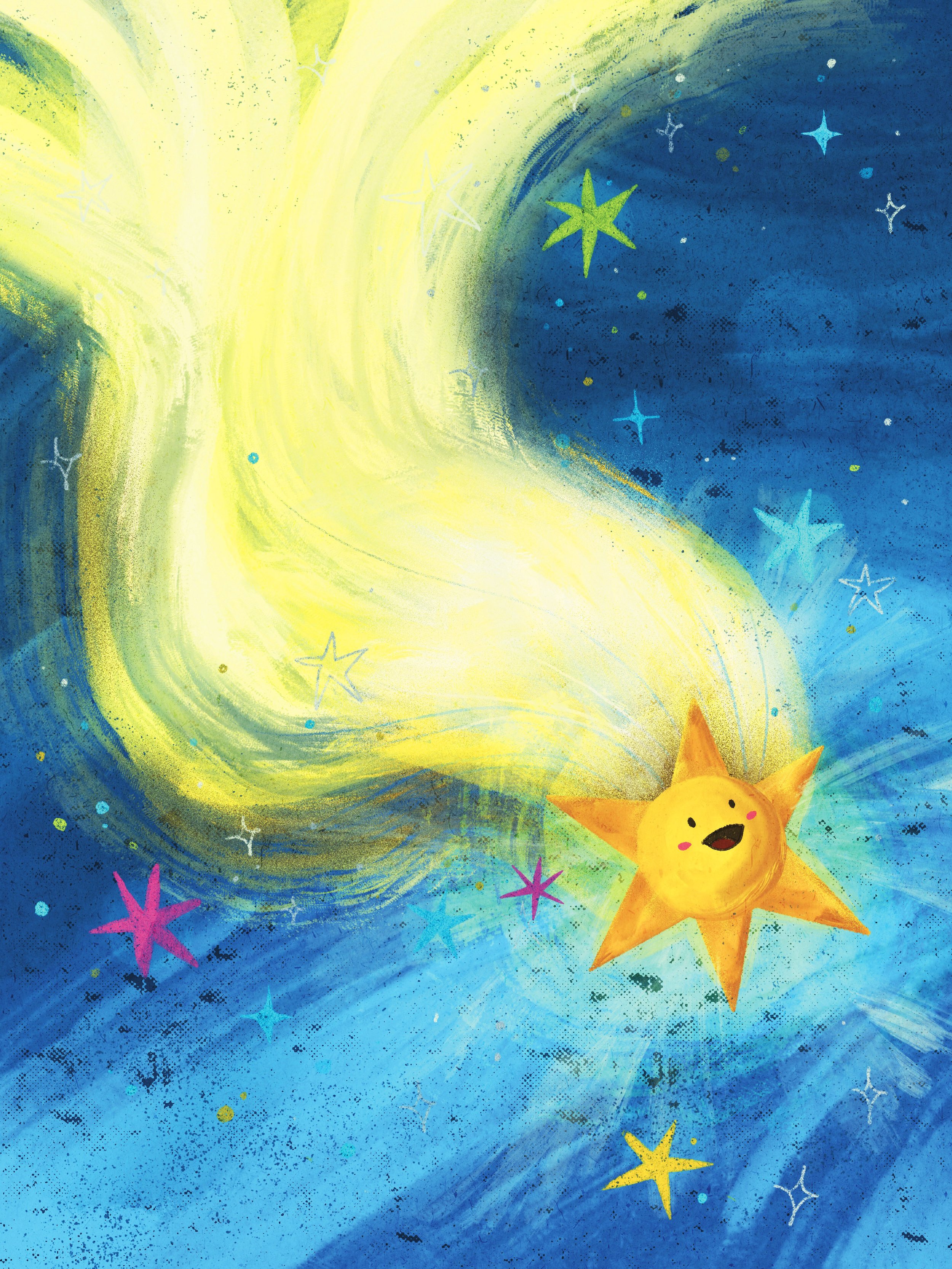
“An Alphabetical Astronomical (sorta musical) Adventure “Launches Young Readers into Space-themed Tongue-Twisting Fun!

The joy I felt upon learning that my banner was chosen surpassed the typical victory of a design competition. To me, it felt like a 'welcome home' gift—a waving banner guiding me back to my hometown.

When École Quarterway Elementary School students return from winter break and walk to school again, they’ll spot new colourful designs that are like “a storybook come to life” along Bowen Road.

“I almost fell on the floor,” Scott said. “Here was this grown woman out in the world, beautiful, intelligent, and it was this little girl that I wrote to who I never met until this moment. And she is now the author of these two books.”

VIU Graphic Design alum Amy Pye is channelling her creativity into a new medium these days –children’s books. While she is still doing marketing design work during the day – both with her own company, Pye Design, and as Art Director with Real Estate Webmasters – earlier this year, she published two children’s books.

A new children’s book by a Victoria author is teaching kids the importance of doing their part to fight COVID-19.

Well, I did it. I can cross it off my bucket list…finally. I’ve written and illustrated my first Children’s book! G is for Grizzly Bear is now available through Amazon and through my website at www.artbyamy.ca. On the website, you will also find a list of local retailers.
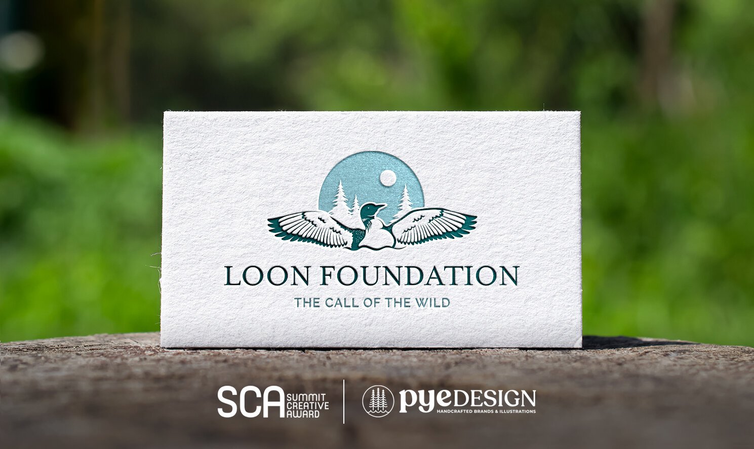
Out of more than 4,100 submissions from 27 countries, Pye Design is named a Silver winner in the 2020 Summit Creative Award competition for its creative work for the Loon Foundation.

If you know me, you know that Tofino is my happy place. I have spent many years hiking up and down Radar Hill, visiting the House of Himwitsa First Nations Art Gallery, being thrashed about on a surfboard (I need lessons), and exploring the Lone Cone trail. So when Hotel Zed approached me to help them market their new Tofino location, I was stoked (as a Tofitian might say).

We've been working with the EarthFair Store for several years. Their brand existed long before Pye Design and was a spur of the moment design put together by the sign company. For many years, it worked. But it didn't really represent them or what they stood for.

Happy to announce that Pye Design has a NEW HOME! You can now find us at Unit 305, 3450 Uptown Boulevard, just above the Best Buy. We are here Monday to Friday so c’mon by for some java and a tour!

I designed these banners pre-Covid. When I created them, I was simply following the brief that had been supplied. Rotary does wonderful things for the community and the goal was to represent their core values, which include promoting peace, fighting disease, growing local economies, saving mother and children, supporting education and providing clean water, sanitation and hygiene.

Canada Day seems like the perfect day to reveal this new brand for the Loon Foundation, does it not?
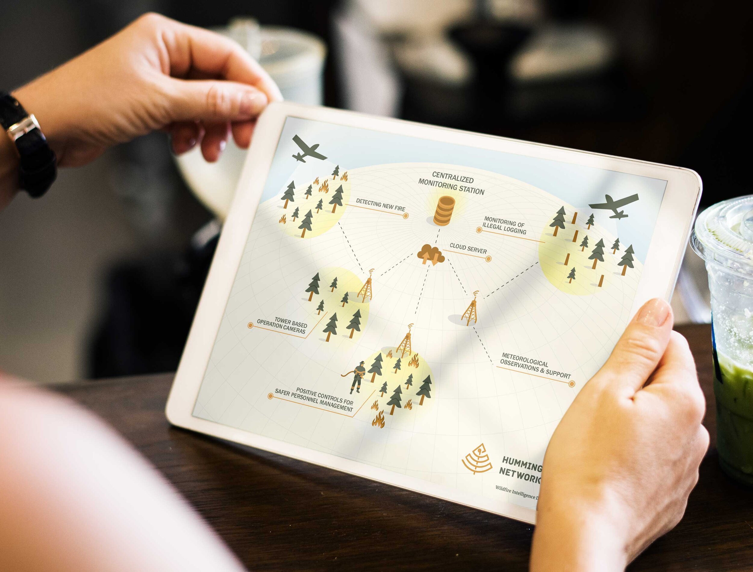
Infographics are graphic visual representations of information, data, or knowledge intended to present information quickly and clearly. If you’re looking for a way to deliver information to your audience in a creative way, infographics could be the way to go. See below for some benefits of using visuals as a form of communication.


There is no denying that The Princess Bride has many memorable characters, but none are quite as iconic as the Dread Pirate Roberts. This enigmatic figure, shrouded in mystery and fear, teaches us a timeless lesson about branding and the importance of name recognition. Let's dive into how the Dread Pirate Roberts exemplifies the power of a name and what we can learn from his legacy.